Interactive Museum App
umd duluth tweed museum
The goal was to create an inclusive, accessible museum for everyone. Visitors with vision impairments are most likely to enjoy this museum
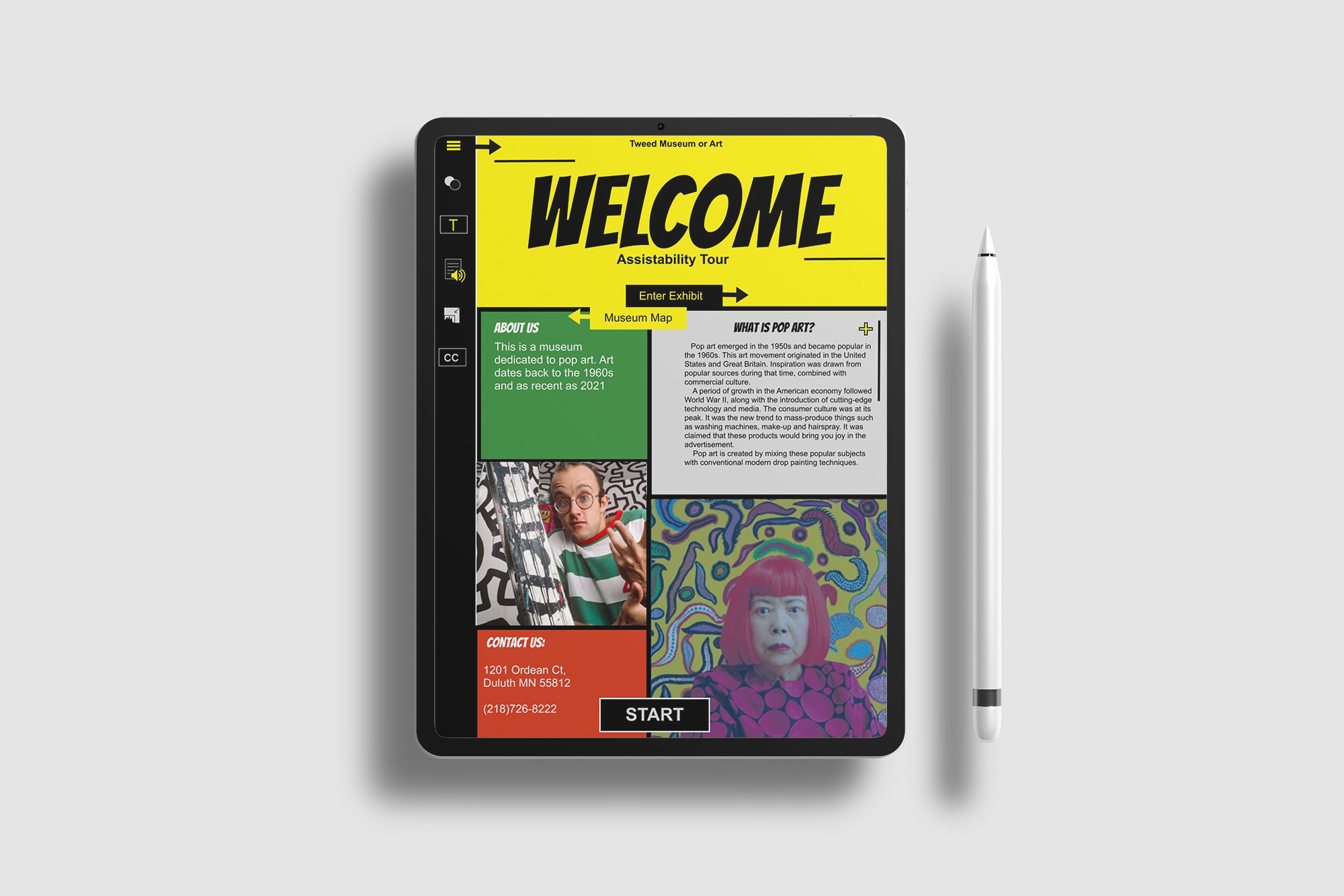
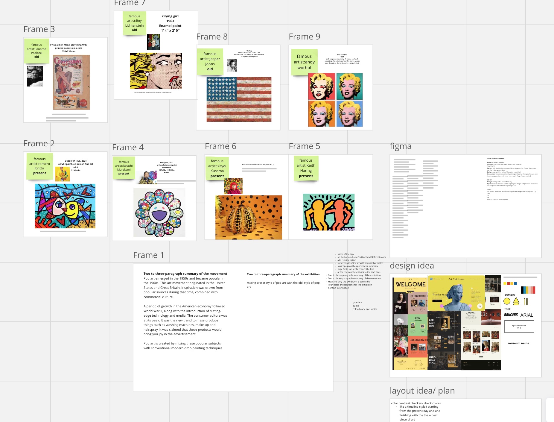
Pop art emerged in the 1950s and became popular in the 1960s. This art movement originated in the United States and Great Britain. Inspiration was drawn from popular sources during that time, combined with commercial culture. A period of growth in the American economy followed World War II, along with the introduction of cutting-edge technology and media. The consumer culture was at its peak. It was the new trend to mass-produce things such as washing machines, make-up, and hairspray. It was claimed that these products would bring you joy in the advertisement. Pop art is created by mixing these popular subjects with conventional modern drop painting techniques.
Case study
The goal was to create an inclusive, accessible museum for everyone. Visitors with vision impairments are most likely to enjoy this museum
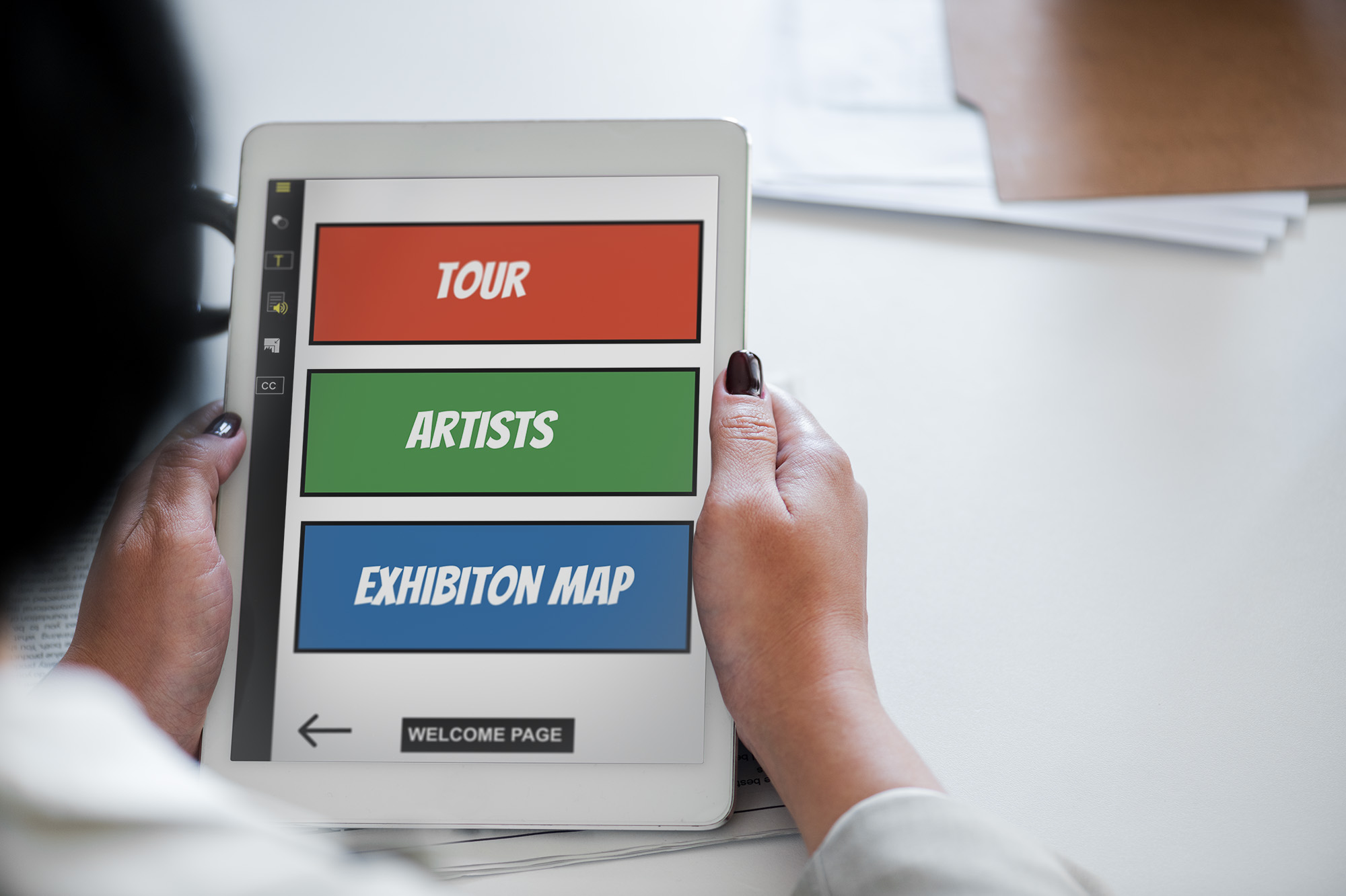
The Accessibility Features
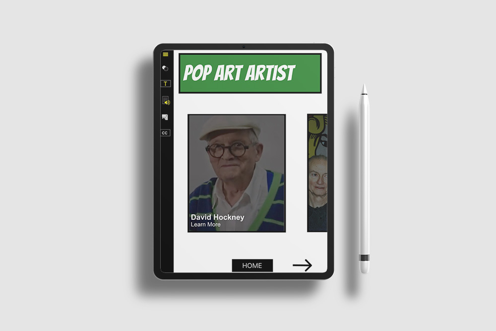
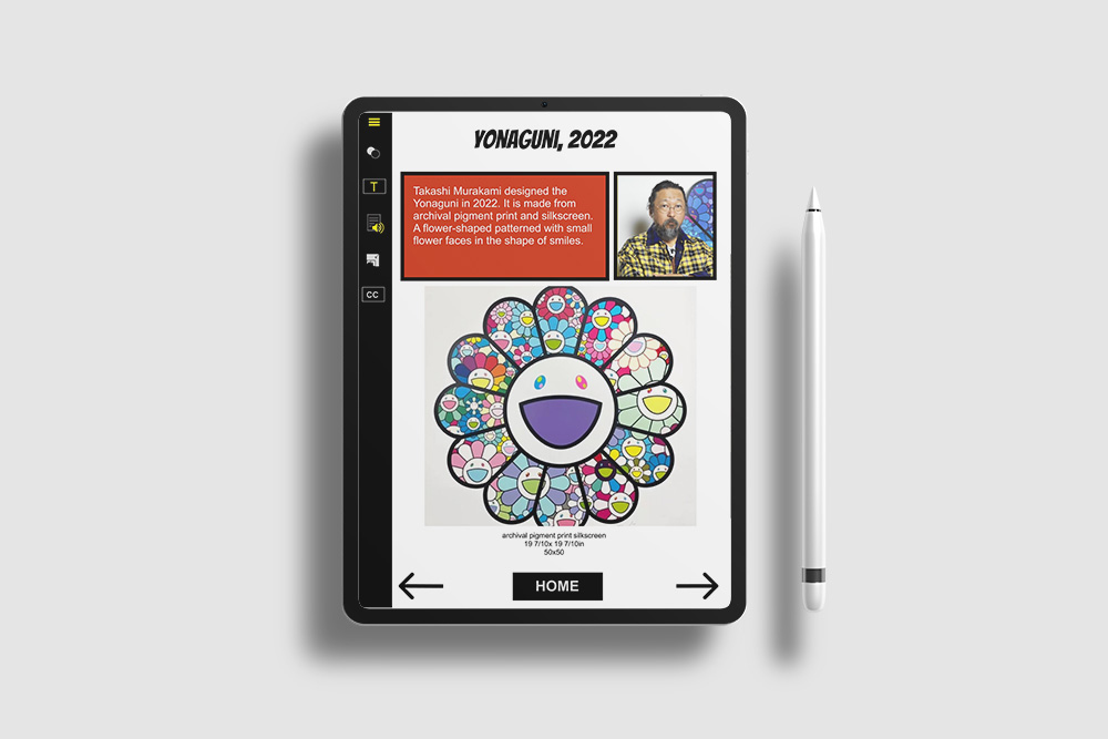
I wanted to keep this design very simple and accessible to use all the user has to do on the app is click the next and previous buttons on the button of the screen to move. This style is also connected to the real-life museum the museum starts every 15 minutes and is connected to the app. When the visitor/app user, goes to the tour is when buzz and Bluetooth connect and start the tour.
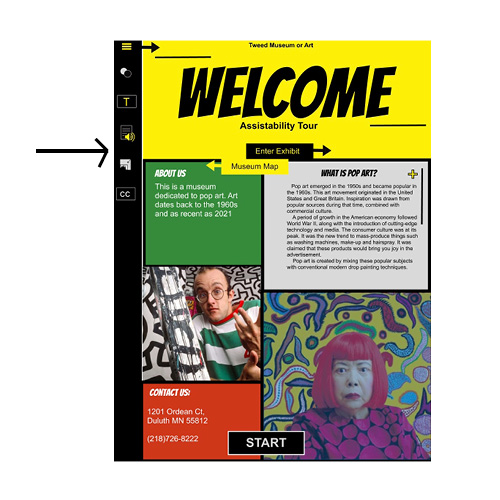
The App
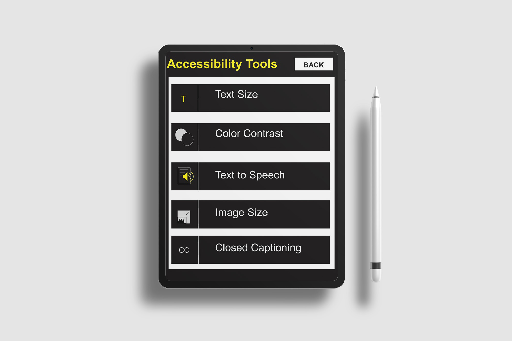
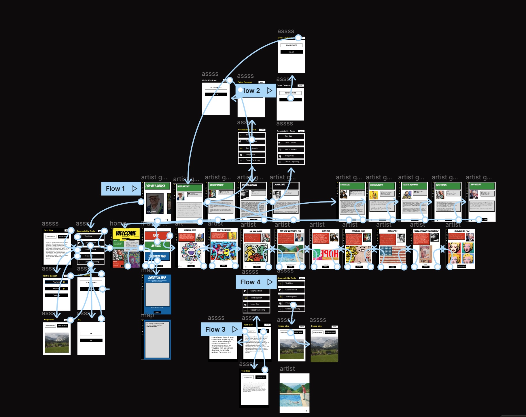
On the left side of the app, you can see an accessible tab. App users can access this tab at any time. As a result, people with disabilities can change the setting to their comfort, at any time during the tour. There are tabs for changing text size, changing the interface of the face from color to black and white, changing the volume of the audio reader, changing the image size, and adding close captions.
The Museum
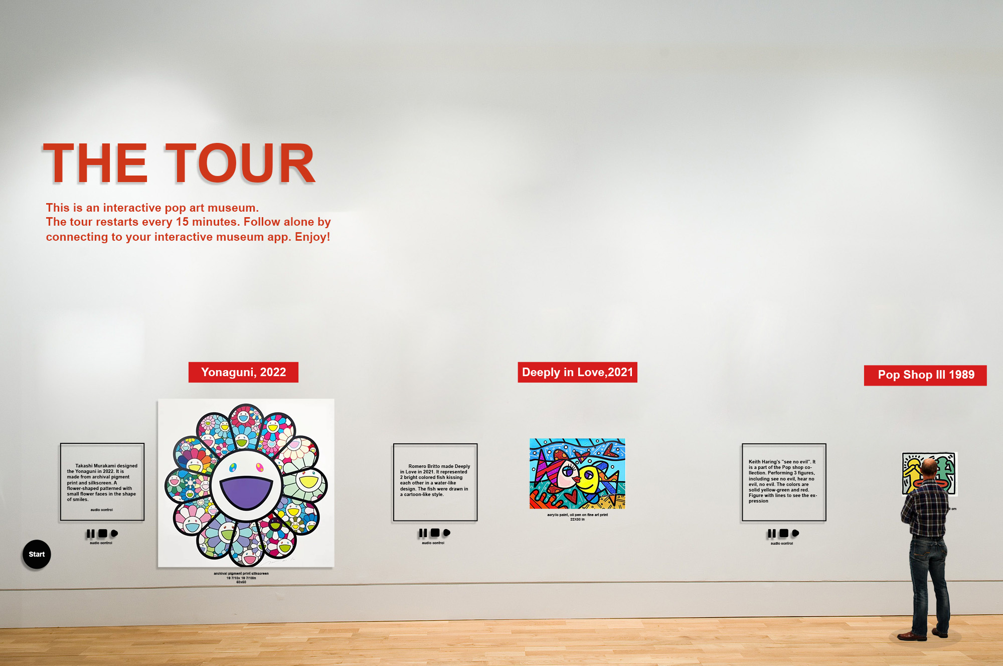
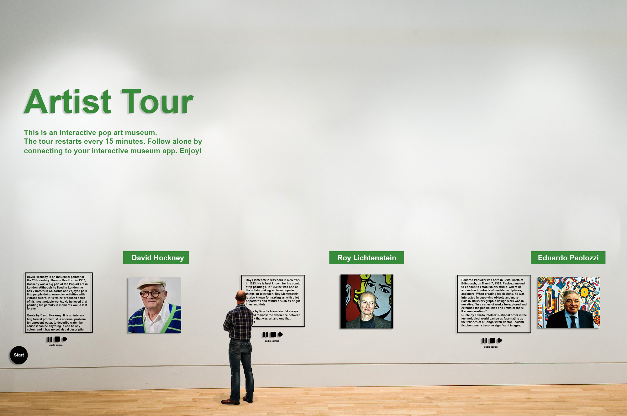
example 1:

example 2:

Brainstorm/ Wireframe
In terms of colors,
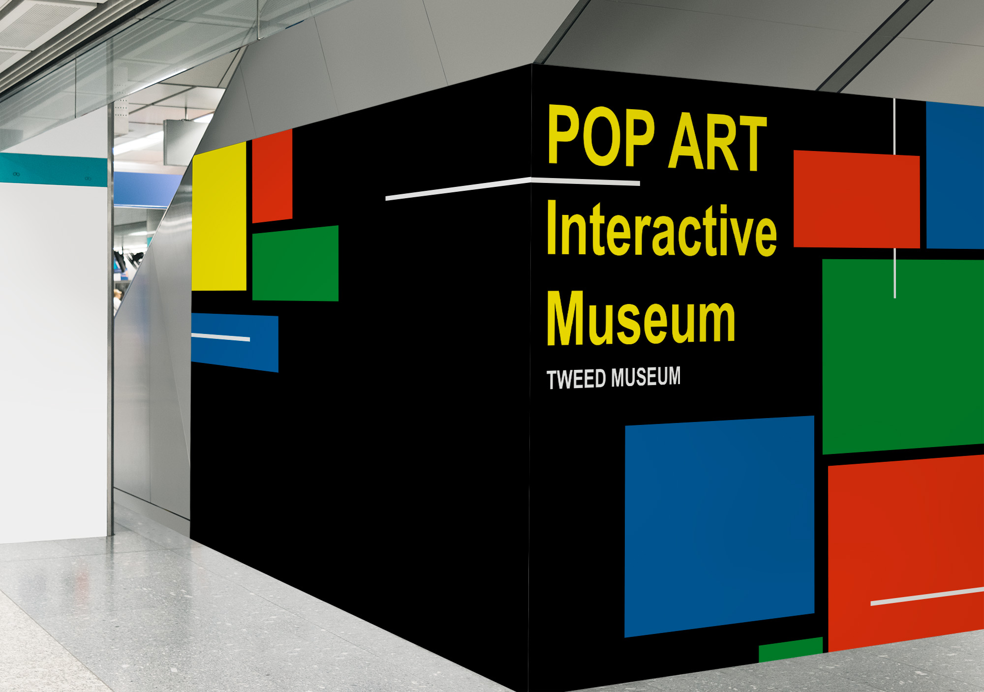
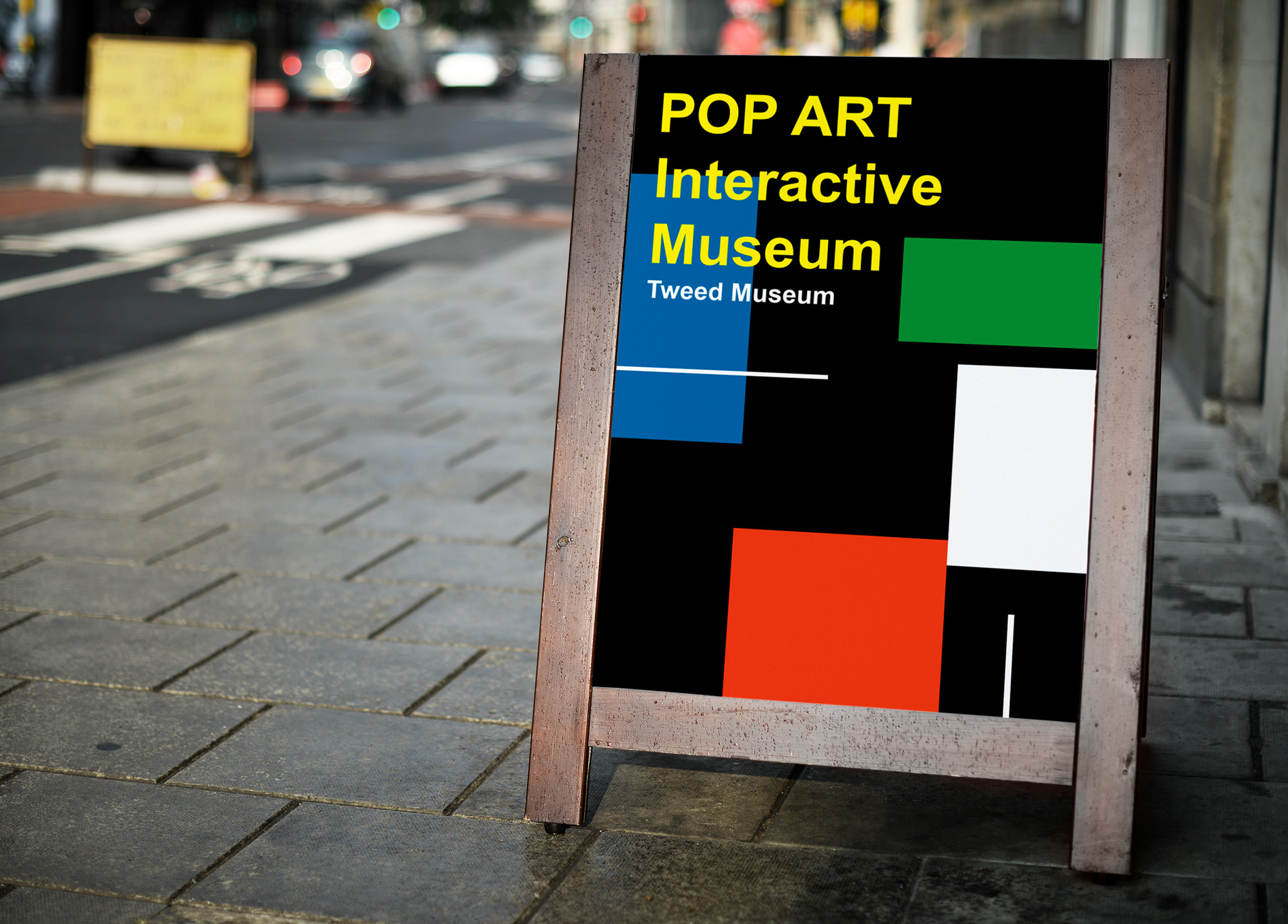
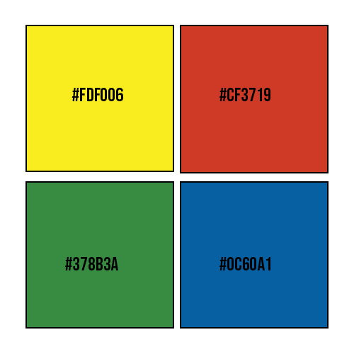
It is also more accessible for people with low vision to see colors and fonts with more contrast. Because of this, I chose colors that are very pigmented, while also making sure the color combinations are readable on a computer screen. I went with green, red, and yellow, not only because of their accessibility but because it fits the pop art theme of the museum.
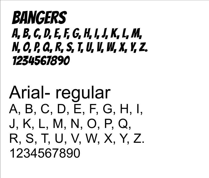
Font
It is important to remember that this app was designed less for aesthetic pleasure and more for assessability purposes. To keep things simple, I chose Banger as my main font devoted font and Arial Bold as my main text font.
Signage
